Brief
OC 2 Task 3: Classic Still Life
You have been commissioned to produce one image using studio lighting as a test
shot for an advertising agency handling a major account. They are looking for a photographer to produce a ‘classic’ still life image for the cover of a high quality, complimentary customer magazine.
The Agency requires ‘a classic still life image’ in the style of the ‘Flemish Still Life Artists’
to introduce a new campaign and your lighting, choice of props and foreground and
background must convey this.
● No hands, or human forms – strictly inanimate still life.
● One or more reflective object(s) must be used as part of the still life.
● Plan a studio shoot with notes and sketches in your Blog.
● Consider the possibilities and limitations of the studio, viewpoint, focus, quality
of light.
Submission – One A3 colour print required with white border. Portrait or Landscape.
Research & Ideas
Symbolism in Still Life
- Artichokes, asparagus and berries represent the fruits of Paradise or Heaven
- Lemons were an expensive food item, the bitterness represents the deceptive allure or attraction of earthly beauty
- Flowers have different meanings. They represent innocence, seasons, or religious symbols
- The apple: Another big one in that there are many meanings. It can signify love, knowledge, wisdom, joy, and death. In religious works it usually means temptation, and original sin. The apple is also associated with a woman’s anatomy, breasts in particular, and then the core of the halved apple representing her sexuality or reproductive parts.
- The peach symbolises truth and salvation, and can be used instead of an apple
- Feathers symbolise of hope, faith, and charity, freedom (by enabling flight) and the heavens.
- Skulls or bones symbolise mortality, inner contemplation, and eternity.
- Books are for knowledge and like lemons were expensive and showed wealth
- Candles can stand for time, and faith. When blown out it means death or loss of virginity. It can symbolise light in the darkness of a lonely individual, or the light of Christ, purification or cleansing.
- Clocks & hourglasses represent time
- Birds represent rebirth
- Eggs represent the circle of life
Other features of Flemish style Still Life
- Memento Mori (Remember you must die) – paintings which remind the viewer of their mortality
- Vanitas – shows the worthlessness of worldly pleasures
- The colours are generally muted and can be quite dark, a lot of brown is used
- Items arranged at various heights
- Folded material like a tablecloth or curtain are often used
- Other items used include goblets, glass, wine, pipes, shells, game etc
Research

Willem Claesz. Heda, Still Life with a Gilt Cup, 1635
I quite like things neat and in order, and it wouldn’t come naturally to me to lay things on their side, have different kinds of metal together and have tablecloths scrunched up. However I have been researching it and discovering that there is symbolism behind some of these things which now means the Flemish style makes more sense to me. The other thing is I was concentrating on what might go together i.e. If I used fish in the photo, what would go with it in a dish – but that’s not how this works, its all about what it looks like and what it represents. Heda is known for his very realistic paintings, this looks like a photograph! The thing I like about this picture and the Flemish style is the way the scene is built up. Nothing is flat, there is something to look at on all levels. I like the tones used.

Willem Van Aelst, Still Life with Mouse and Candle
This is less realistic but what I like is it is clear in what it represents with the decaying fruit and the extinguished candle. The lighting in the painting is beautiful, it really directs the eye to the fruit and the mouse is just discreetly sneaking in the side not drawing too much attention. Nice composition your eye goes from the fruit to the candle to the mouse, I like images where the eye has to move to take in the picture properly.
The Shoot
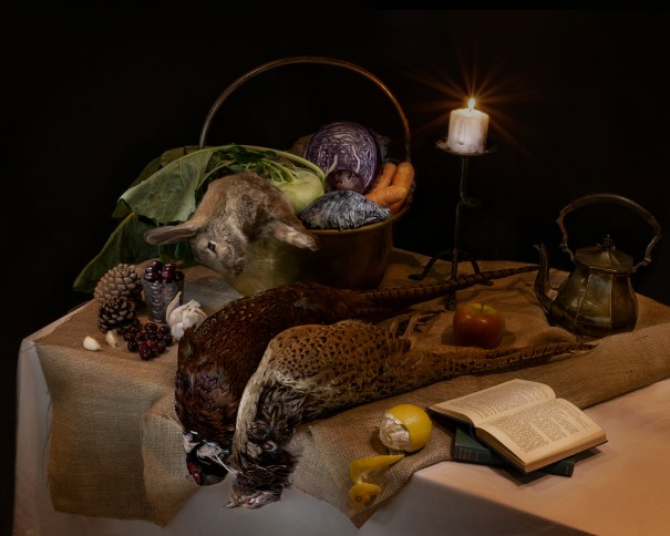
Speaking of shooting, I decided to get pheasants from the Butcher for this. Went I went in there was a rabbit in the window (stuffed) I enquired and she brought me through different pheasants, rabbits and a hare to choose what I wanted. I hated doing it but I really wanted to push myself out of my comfort zone and get a good traditional Flemish shot. The difference between this and my last still life is astounding, I feel embarrassed by the last one, which I think is a good thing.
Items
- Rabbit, pair of Pheasants – George Bower Butcher, Stockbridge
- Vegetables (Kohl Rabi, Purple Cabbage, Onion, Garlic, Cranberries, Lemon, Apple_ – Grocers & Sainsburys
- Books, teapot, candlestick – charity shops
- Brass bucket and pinecones – from my mum’s house
- Hessian – Amazon (I’d like to collect a few materials for backgrounds and Still Lifes)
Set-up
I composed bit at a time, I put the table diagonally so I could get everything in and didn’t want it straight on. I knew I wanted it to peak up to the handle of the basket and drop down at the edges. I put a sheet on a board to make the table, carefully folded the hessian, although I didn’t press that as I wanted it rustic and not too perfect. The rabbit is in the pot a bit like a stew, it wasn’t that easy to move as it’s spine was still in tact. My husband offered to break it but this was a step too far for me and I didn’t want it to be too floppy either. The pheasants were limp which was good as most pics you see them in their heads are dangling over the side of the table. I wanted to stick with doing this and think it shows off their plumage. This was the same with the lemon on the edge hanging off. There is a book underneath the apple and candle stick so they didn’t disappear, the book being Langford’s Basic Photography!
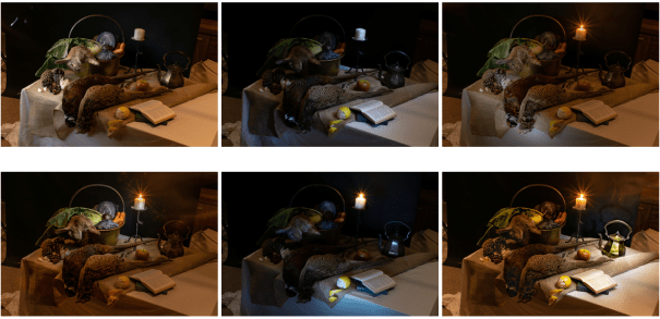
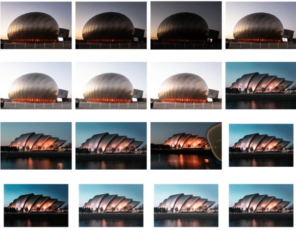
I used a 30 second exposure, f/22, ISO 100. I used an LED torch to paint the light into the scene. I did it section by section. I really enjoyed it, it may be my favourite shot so far.
I am really pleased with it, I honestly didn’t know I could pull this kind of photo off! If I were to change anything it would be 1. the camera angle, I should have looked properly in the light with the grid as I had the lights off to light paint the scene 2. I moved the table slightly round and in doing so captured more of the bottom right corner than I had set up. All I needed to do is move the books an inch or so the the right. However making wee mistakes helps me learn as I know what to change next time.
Post-Production
I comped photos together to show the lit areas in each, this was easy I’ve done it before using masks. There was a lot of dodging and burning. I put a sepia gradient in. I had to change the background I replaced the rabbit’s eye because it was glazed and sticky and think it made it look out of focus.
Attempts
Final Image
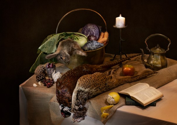
Take 1!
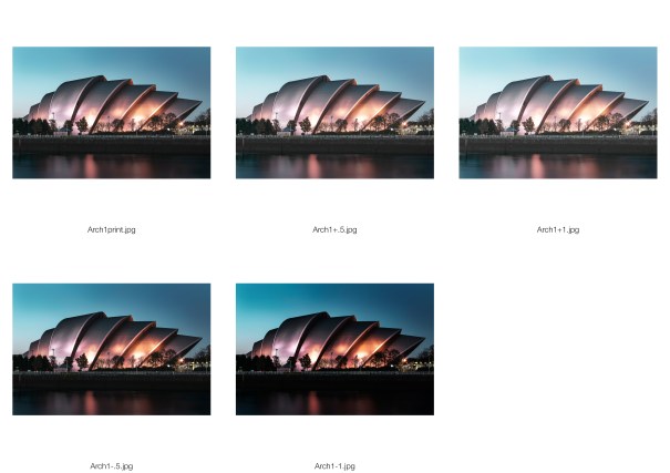
Went over it with Ronnie in class who pointed a few things out so I changed them (below) The candle and teapot are straighter, the background lighter although for some reason it is difficult to tell here. More details brought out. I will do a print test as I feel I might need to go .5 – 1 stop lighter. I don’t know what paper to use. I am thinking lustre as I don’t know if it would be too much on gloss and too dark on matte. Although really in the sleeves it doesn’t make so much of a difference. I also changed it to the correct ratio.
Take 2


 Ribbon Chapel by Eugene Wei
 Gewinner Residence – Architecture Magazine
 Strobing – Mike Kelley
 Before


You must be logged in to post a comment.