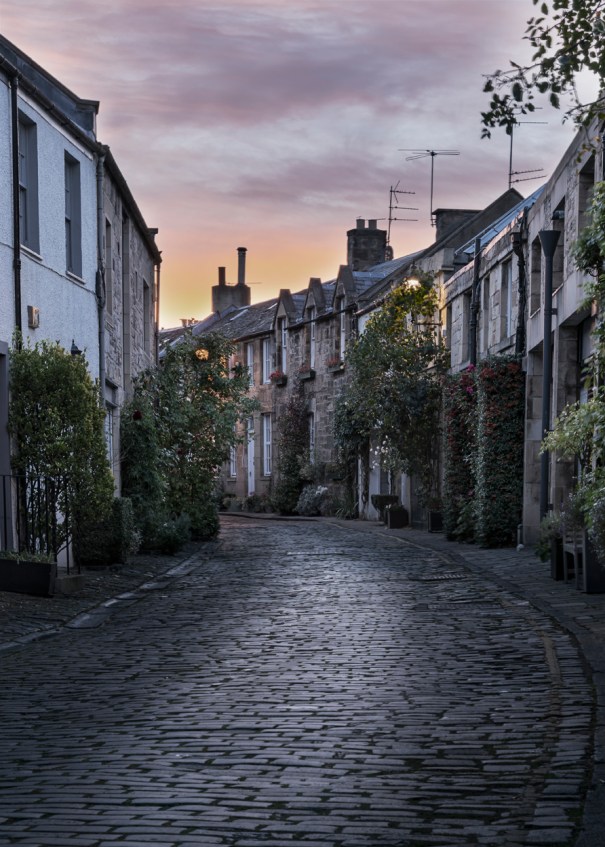
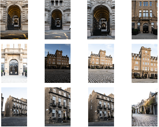
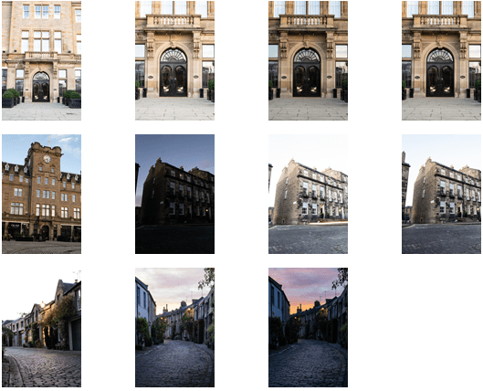
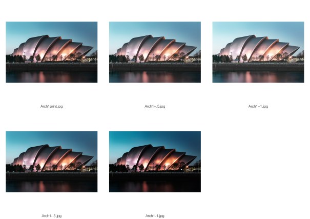
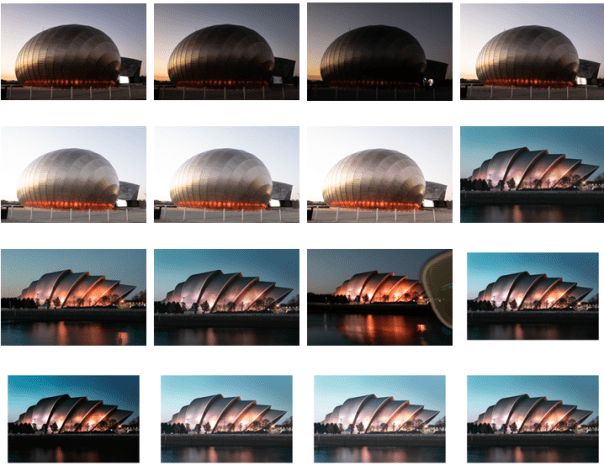
We had Class Critique for our Architecture on 30th October 2018. I was happy with the feedback and found it fair. I had researched this one quite a lot and think, hopefully, that it showed. The only thing that came up was how with it being a tight crop it may be difficult to place a model without hiding some of the details in the image. I had misunderstood and thought it was to be portrait but it’s a possibility that I could go back through to Glasgow and reshoot which I would be happy to do. However I had two shots I was debating over using so I am putting this up for feedback and to decide if this would be a better shot to use. It is a comped picture, I bracketed to get the beautiful sky I was lucky to have that night and to get maximum detail in the buildings. The only thing I would maybe do is desaturate the sky a bit so it fits the colour scheme I wanted – more neutral and taking less of the focus. It’s Circus Lane in Stockbridge and it could be a mews development in London which also fitted into my idea. As an aside in Crit I was asked how many shoots I did for this and I said 1. For some reason I wasn’t thinking about the others I took in Stockbridge, New Town and Malmaison in Leith! I think this is because I had the 1 solid idea for the one I took in Glasgow, went, took the shots and was happy with them. The others I took more recently and was out with my camera and tripod, it wasn’t planned so I didn’t think about it. However I did really love this shot, I just didn’t know if I could use it. I think I could place a model in here easily.
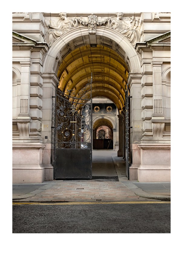
Before
f/6.3 1/40 ISO 400
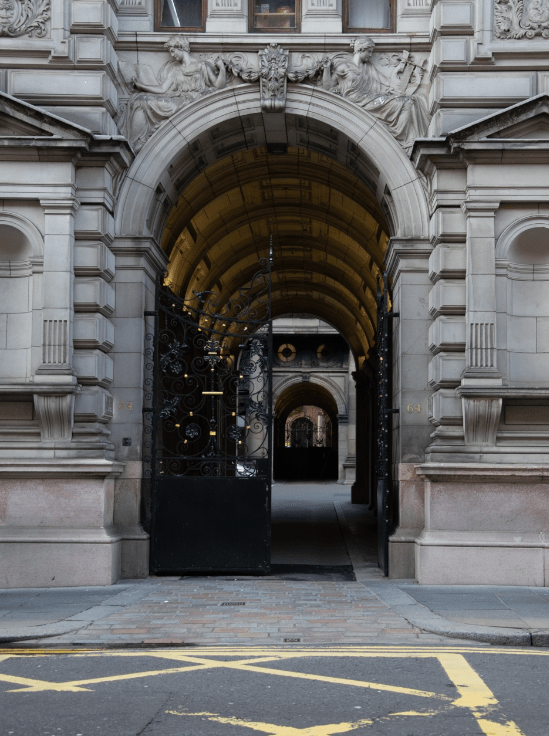
- Applied lens corrections
- Added clarity
- Colour corrected the image
- Changed the perspective to make the building more upright
- Cropped to a 5×7 ratio
- Sharpened with a USM
- Toned the image to add contrast and warm the image up slightly
- Used dodge and burn to lighten areas – blacks mostly
- Brightened the lights in the arch and the round windows at the back
- I felt the image was ruined by the yellow markings on the ground so I took the tarmac I had from another image and masked it over – I used transform to change the angle so it fitted in
- Used the clone tool to duplicate the left round window and place it over the right one which was less visually appealing.
Print Test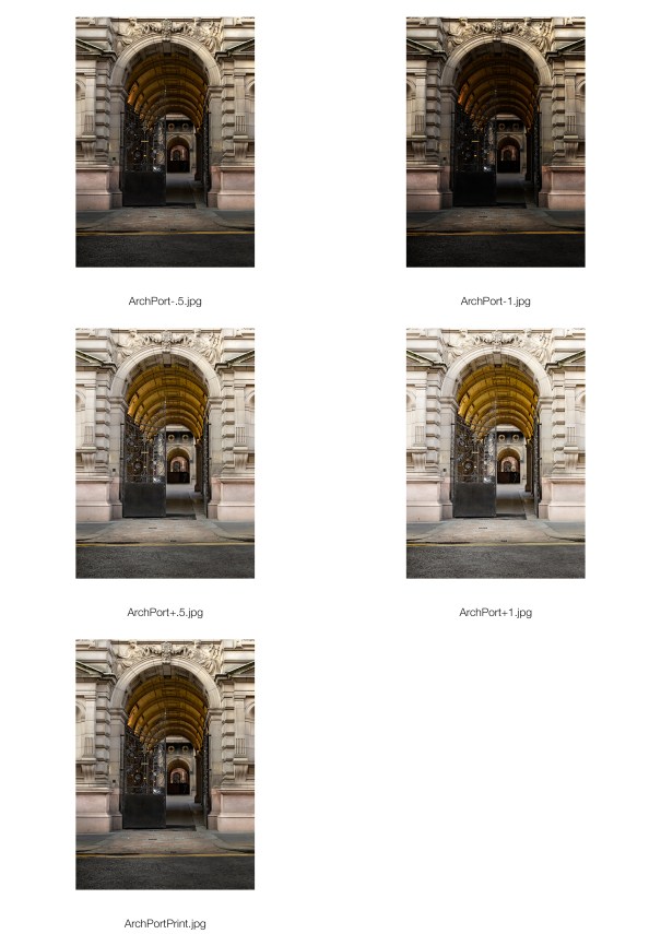
Contact Sheet
Inspiration
Inspiration
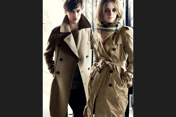
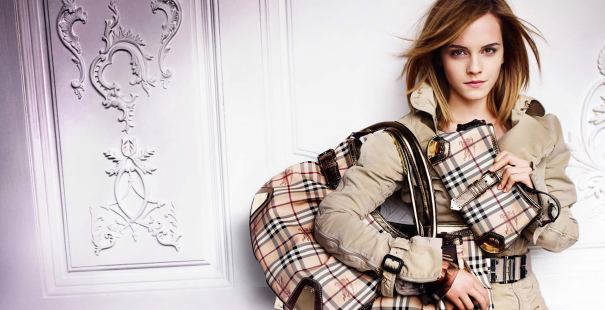
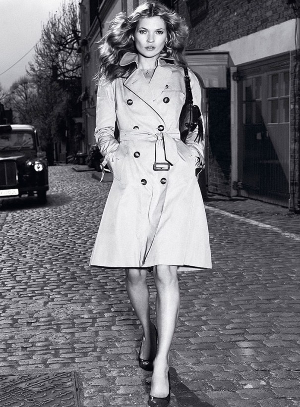
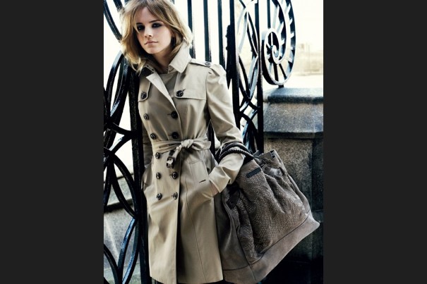
My inspiration for the Architectural Portrait is Burberry.
Above images shot by Mario Testino who has a long history working with Burberry. The images above are on location (or shot to look like they are) I think the Kate Moss image has maybe been shot in the studio and added to the background in Photoshop. I am not sure. That’s what we have to do for this task. The reason I have chosen these images for inspiration is 1. The colours – neutral tones, beiges, creams and blacks. These are synonymous with the brand 2. The backdrops, a city street, interesting features, make me think ‘London’ where the brand is based.
I was inspired by the adverts below, I like the locations, the images look high-end and classic and is the sort of time period when the Burberry brand had those connotations as opposed to the nineties when the brand’s image took a nose-dive. Thankfully that began to change when Christopher Bailey took over.


Below, the images are more up to date – there’s Brooklyn Beckham taking the shot on the left! On the right is a still from a video ad, the architecture seen in the background is similar to the kind of architecture I wanted to shoot and why I shot in Glasgow. I wanted a doorway/gates/arch to frame my model.


 Ribbon Chapel by Eugene Wei
 Gewinner Residence – Architecture Magazine
 Strobing – Mike Kelley
You must be logged in to post a comment.