Architecture – Evaluation

Edinburgh College

HN1 Photography

Unit Evaluation 

Summative Assessment

Name: Jill Barnett

Class Group: B

Unit: Architecture


Introduction

The briefs were as follows;

Interior Architectural Image

The Interior I chose was Kilberry Bagpipe makers. I was using this for my Corporate and thought it would also be ideal for the interior image, I like the contrast in the warm toned flooring and the cool tones outside the window. The challenge there is it is narrow and not deep but has very high ceilings and I wanted to capture the writing at the top of the windows. It is also a mixture of lighting – natural daylight, tungsten lamps and fluorescent strip lights further back. I think it is an interesting image with plenty to look at and it’s a well used workshop with very old tools and machinery so I think it works. The whole place was interesting to shoot.

Interior Architectural Image forming part of a set of four images with a Still Life image and two Portraits. Commissioned by a magazine.

This was shot in the Commercial Pub in Larbert. It was shot with window light, tungsten light and fill flash to light up the stools around the right hand side of the bar. The room itself is really small and I was in the wee entrance hall to take the photos and I took them as wide as I could without getting the doorway and things in the shot. I like the image as I think the Pub looks good in it. The owners are family and I know they were pleased with it too.

Architectural Exterior

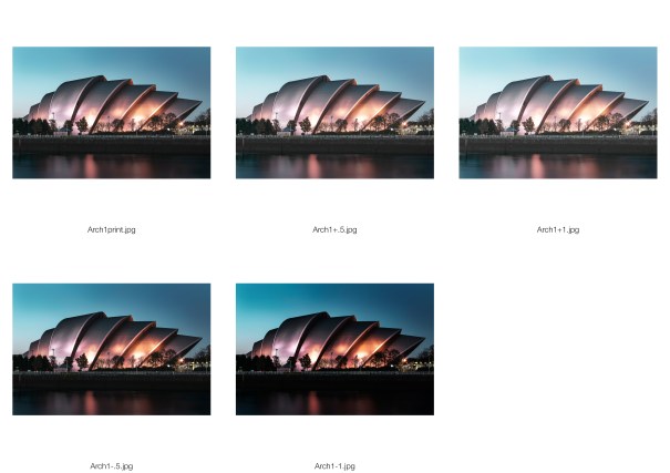
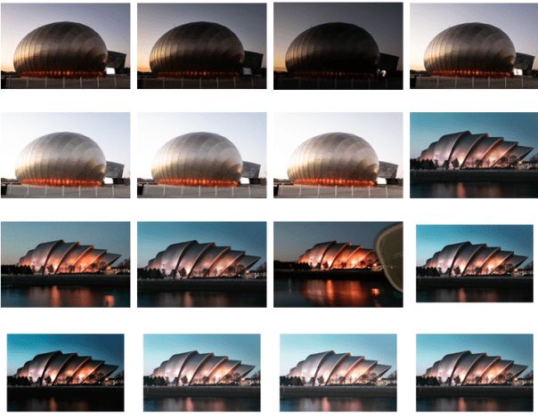
A long exposure here of the SECC. I took it as the sun was going down. I bracketed and took around five shots to get the river light enough and not burn out the highlights on the building. I think I probably could have lightened it further.

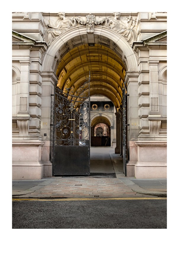
Architectural Exterior to be integrated with Portraiture, informed by a fashion brand of your choice

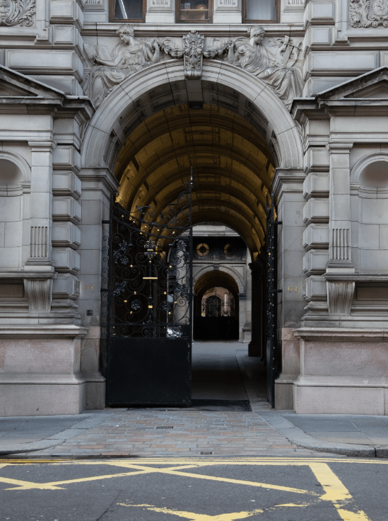
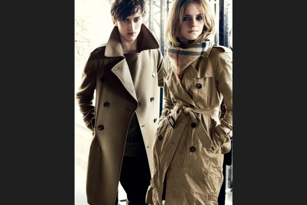
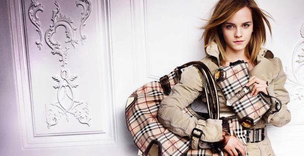
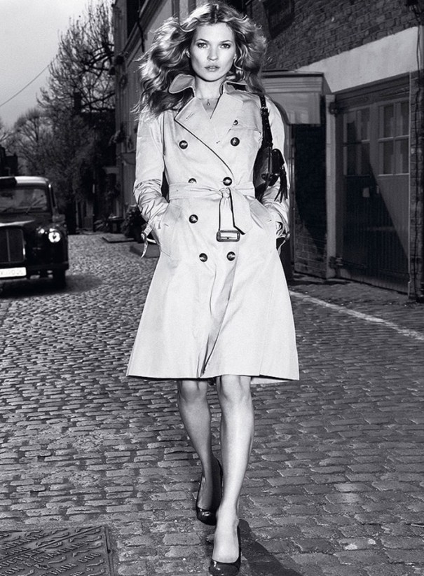
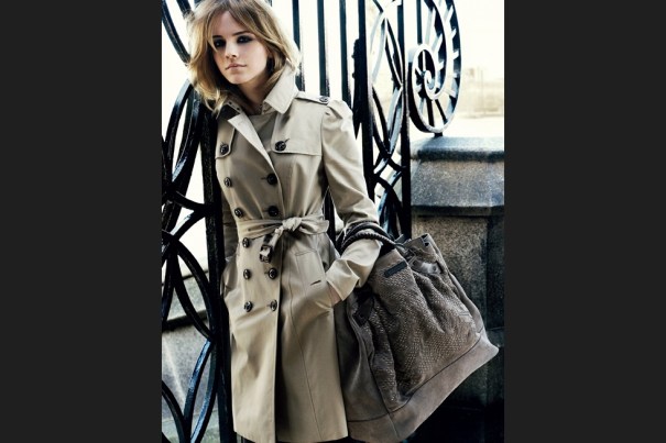
This was inspired by Burberry. I have always loved Burberry as a classic British brand. I shot a building just of George Square in Glasgow. I hadn’t planned that but as soon as I seen the big gates and the interesting details behind and surrounding them I was drawn to it. The colours in the shot really lend themselves to a Burberry advertisement.

Creative Interpretation of an Architectural Exterior

This was taken at Rosslynlee Asylum in Roslin. I thought the building was different as it was almost like a long hut but when you went inside it feels like it goes on forever. This shot I like because it is a funny shaped building and you can see where it has a couple of turns. I like the specific angle I shot it at with leading lines, the creepy windows and it’s still quite light and soft tones, a lot of mid tones which is unusual as mines usually have more on the dark side.

Positive Aspects

I like Architecture, especially if it has something quirky, maybe a lot of shiny details or a cool reflection in the windows. Or something like a random open door when everything else is uniformed. Thats what works in the last photograph, the open windows pulling you in, intriguing, and it’s what I like about Kilberry too. The rough, take it as you find it nature of a workshop. A lot of dirt and signs of hard graft make it more interesting. These are my two favourite images.

Areas for Improvement

I over processed the Clyde Armadillo looking back on it. I have a tendency to go a bit dark on my images I think (hope) I am getting better as I am really trying to get away from that. I know myself but still seem to do it.

Evaluation of Learning

I spent a while on the Armadillo walking up and down the river to get the best angle. I think I filled the frame a little much I could have left a bit breathing space at the edges. That and the over processing as mentioned above are points to keep in mind for future. I also learned to plan for extra time should things go wrong etc. In the pub I went way before opening in the morning thinking I had more than enough time to shoot however I was still working as it was opening, mainly due to the lighting kit taking time to set up in various places.

Architecture Research


Related image

  • Julius Shulman, 1958
  • Bailey House
  • Architect is Pierre Koenig
  • Style is fine art
  • Images shown in galleries and museums all over the world
  • 5×4 crop
  • Silver gelatine print
  • His work, all modernist, much of it based in LA has a geometric look to it. Partly because of the architecture itself of course but using black and white film to shoot adds to the geometry due to removing distracting colours and making it all about the shapes. He uses leading lines and rule of thirds a lot


Related image

  • Julius Shulman, 1947
  • Kauffman House
  • Architect Richard Neutra
  • 5×4 crop
  • Silver gelatine print
  • Story behind this is the photographer, Schulman was photographing interiors at this house for the Architect. He seen outside was lit beautifully highlighting the hills etc. The architect told him he wasn’t allowed to go out and photograph it but he packed his kit up and went outside and did it anyway. He put it on a long exposure and ran in the house and put different lights on for different times etc. Right at the end he asked the architects wife to lie down on the lounger by the pool. Then he got dragged back in! To this day it is one of his most renowned photographs. Shulman has lots of good stories about his photographs which I think makes his work even better to look at – when there is a story about it
  • I wanted to compare two of his images, I think these two are quite different. For me the Bailey house is my favourite. I love the bright tones, high contrast and clean lines although I think this image was done really well too and it’s amazing that it was unplanned and came out a piece of famous art. In the first image we are right in the house focusing on the angles, the second I feel was less focused on the building and more used it just as a part of an image


Eugene Wei

  • Eugene Wei
  • Ribbon Chapel
  • This is an interesting subject and I’ve seen many good photos of it, I chose this one because of the lighting and sky
  • I assume it was taken at dusk and the setting sun casts a beautiful light on the inside of the ribbon
  • The subject is in the centre and takes up most of the frame and the path leads your eye straight to the architecture


gewinner-residence_-7416

  • Gewinner Residence
  • Architecture Magazine
  • Cool, Geometric building
  • Use of Rule of thirds and Negative Space
  • I like how the sky is light at one side and dramatic at the other where the large sharp edges are
  • I like the contrast of the warm lights inside against the cool tones outside.


Mike Kelley

  • Mike Kelley
  • Strobing
  • I watched the process of this image being made. Mike Kelley uses two speedlights to light the entire subject in stages and then layers the images in Photoshop. I thought it was quite an interesting thing to do. I have done this before but not with architecture!


Screen Shot 2019-03-27 at 21.14.14.png

  • Berenice Abbott, 1936
  • Penn Station
  • 5×4
  • Silver gelatin print
  • Reading about Abbott’s work there was something said about how although her subjects were of stone etc, they had the emotion of a portrait, and talking about how she could even shoot girders in a pictorial style. This is what I like about her stuff. It is set in New York, a city which just oozes character, and her photographs reflect this. I love the light coming in through the many small panes of glass, the smoke lit up in the concourse behind the sharp dark structures at the front of the image.


Image result for Richard Nickel

  • Richard Nickel
  • Around 1960
  • Natural light
  • Taught photography by Aaron Siskind who gave him and his fellow classmates and assignment (one day in the 50’s) to go out in Chicago and photograph buildings by architect Louis Sullivan. Nickel had had no interest in architecture before then but found himself captivated by Sullivan’s work. He then spent the rest of his life photographing these buildings and campaigning against their closures. He eventually died trying to salvage architecture from one of these demolished buildings after it collapsed on him in 1973.
  • I would think this would be in the category ‘creative interpretation’ of architecture
  • The several layers of different styles attracted me to this image. Bright lights and fanciness at street level, then up to the romanesque arches with the intricate carvings then up again to a level which looks split in half. I find it exciting to look at
  • The image works well with the people in it. I don’t think it would’ve been quite as perfect to me without the people giving scale and life to the photo
  • It really suits being black and white. Everything stands out without any clashing colours which may have made it too much

Architecture – Portrait

We had Class Critique for our Architecture on 30th October 2018. I was happy with the feedback and found it fair. I had researched this one quite a lot and think, hopefully, that it showed.  The only thing that came up was how with it being a tight crop it may be difficult to place a model without hiding some of the details in the image. I had misunderstood and thought it was to be portrait but it’s a possibility that I could go back through to Glasgow and reshoot which I would be happy to do. However I had two shots I was debating over using so I am putting this up for feedback and to decide if this would be a better shot to use. It is a comped picture, I bracketed to get the beautiful sky I was lucky to have that night and to get maximum detail in the buildings. The only thing I would maybe do is desaturate the sky a bit so it fits the colour scheme I wanted – more neutral and taking less of the focus. It’s Circus Lane in Stockbridge and it could be a mews development in London which also fitted into my idea. As an aside in Crit I was asked how many shoots I did for this and I said 1. For some reason I wasn’t thinking about the others I took in Stockbridge, New Town and Malmaison in Leith! I think this is because I had the 1 solid idea for the one I took in Glasgow, went, took the shots and was happy with them. The others I took more recently and was out with my camera and tripod, it wasn’t planned so I didn’t think about it. However I did really love this shot, I just didn’t know if I could use it. I think I could place a model in here easily.

CircusLanewebArchPort+.5

Before

f/6.3 1/40 ISO 400

Screen Shot 2018-10-28 at 22.37.22.png

  • Applied lens corrections
  • Added clarity
  • Colour corrected the image
  • Changed the perspective to make the building more upright
  • Cropped to a 5×7 ratio
  • Sharpened with a USM
  • Toned the image to add contrast and warm the image up slightly
  • Used dodge and burn to lighten areas – blacks mostly
  • Brightened the lights in the arch and the round windows at the back
  • I felt the image was ruined by the yellow markings on the ground so I took the tarmac I had from another image and masked it over – I used transform to change the angle so it fitted in
  • Used the clone tool to duplicate the left round window and place it over the right one which was less visually appealing.


Print TestTestPrintArchPort

Contact Sheet

Screen Shot 2018-10-28 at 22.41.53Screen Shot 2018-10-28 at 22.42.00


Inspiration

1202442_Burberry_aw09_emma_watsonburberry-2010-07kate-moss-burberry-trench-coat-2005MarioMario Testino

Inspiration

My inspiration for the Architectural Portrait is Burberry.

Above images shot by Mario Testino who has a long history working with Burberry. The images above are on location (or shot to look like they are) I think the Kate Moss image has  maybe been shot in the studio and added to the background in Photoshop. I am not sure. That’s what we have to do for this task. The reason I have chosen these images for inspiration is 1. The colours – neutral tones, beiges, creams and blacks. These are synonymous with the brand 2. The backdrops, a city street, interesting features, make me think ‘London’ where the brand is based.

I was inspired by the adverts below, I like the locations, the images look high-end and classic and is the sort of time period when the Burberry brand had those connotations as opposed to the nineties when the brand’s image took a nose-dive. Thankfully that began to change when Christopher Bailey took over.


Below, the images are more up to date – there’s Brooklyn Beckham taking the shot on the left! On the right is a still from a video ad, the architecture seen in the background is similar to the kind of architecture I wanted to shoot and why I shot in Glasgow. I wanted a doorway/gates/arch to frame my model.


Architecture – Exterior

Clyde Auditorium (Armadillo)

Arch1print.jpg

Before

f/11 8sec ISO 100

Screen Shot 2018-10-28 at 22.18.52.png


  • Applied lens corrections
  • Added clarity and dehazed
  • Sharpened with a USM
  • Lightened with curves
  • Desaturated slightly with a black and white layer at low opacity
  • Cropped to a 5×7 ratio
  • Dodged and burned. Especially the wall at the riverside which I also used another image for and masked in
  • Used the clone tool to remove the red spot reflecting signage in the river as I thought it was distracting.
  • Applied a high-pass filter

Print TestTestPrintArch1


Contact Sheet

I was there to photograph the Armadillo but when I was there thought about having a go at the Science Centre also. I took multiple shots of each on a tripod so I could mask details in.

Screen Shot 2018-10-28 at 22.24.20

Research

Eugene WeiRibbon Chapel by Eugene Wei

This is an interesting subject and I’ve seen many good photos of it, I chose this one because of the lighting and sky. I assume it was taken at dusk and the setting sun casts a beautiful light on the inside of the ribbon. The subject is in the centre and takes up most of the frame and the path leads your eye straight to the architecture.


gewinner-residence_-7416Gewinner Residence – Architecture Magazine

Cool, Geometric building. Use of Rule of thirds and Negative Space. I like how the sky is light at one side and dramatic at the other where the large sharp edges are. I like the contrast of the warm lights inside against the cool tones outside.


Mike KelleyStrobing – Mike Kelley

I watched the process of this image being made. Mike Kelley uses two speedlights to light the entire subject in stages and then layers the images in Photoshop. I thought it was quite an interesting thing to do. I have done this before but not with architecture!