More research can be found in the individual tasks.
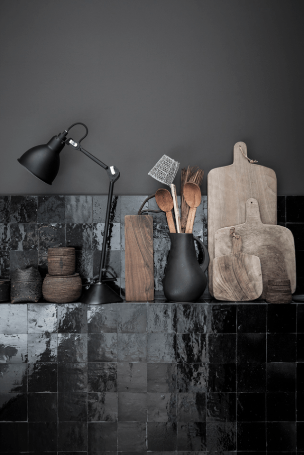
Romain Ricard – The Black Apartment
This image is predominantly dark but there is detail all throughout the image. The glossy tiles are interesting and add depth to the image. The wooden utensils add a nice texture and warmth to an otherwise cool toned colour palette. It’s a good use of portrait orientation, I have seen both landscape and portrait versions of this and prefer this with the rule of thirds and negative space.
Linda Lomelino
I like everythng about this picture. Mixture of chocolate brands used even adds to the picture by not looking too samey. The cloth underneath is textured and cool blue in contrast to the warm brown tones. It looks a mess but has obviously all been placed very carefully to create that look. The spoons and sieve etc are well placed and create an aesthetically pleasing compsition.
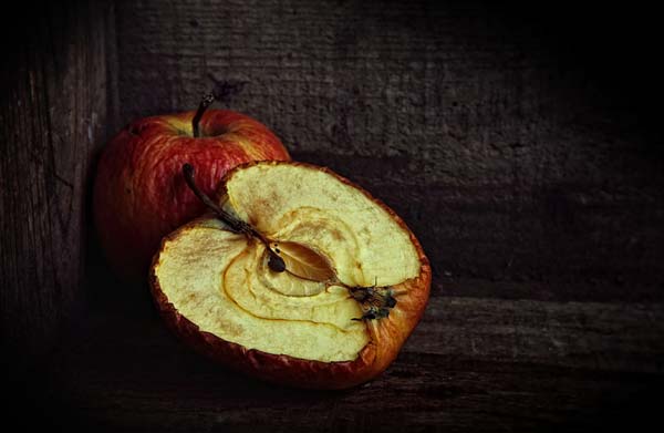
Michel Feugeas
It’s just an apple in a box but it’s a stong image. The apples are decaying and give an old feel. The lighting is good, the light coming in in a spotlight style, giving a vignette. It is almost like the apples are hostages in a room with a tiny ray of daylight coming in. Great textures and tones. The positioning of the apples in the corner of the box gives leading lines, rule of thirds, framing and some negative space.
Images shown in galleries and museums all over the world
5×4 crop
Silver gelatine print
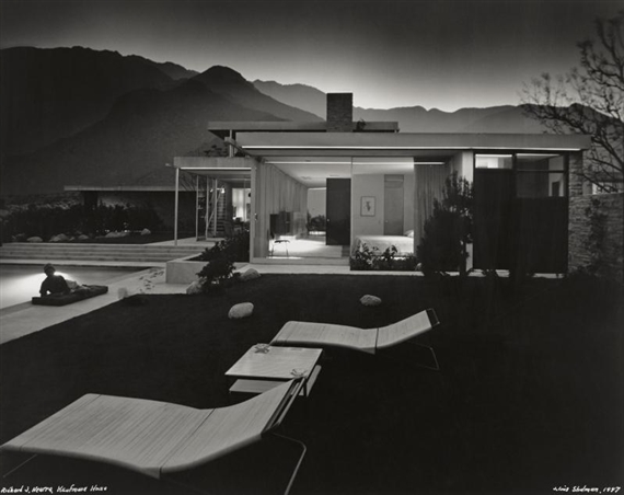
His work, all modernist, much of it based in LA has a geometric look to it. Partly because of the architecture itself of course but using black and white film to shoot adds to the geometry due to removing distracting colours and making it all about the shapes. He uses leading lines and rule of thirds a lot
Julius Shulman, 1947
Kauffman House
Architect Richard Neutra
5×4 crop
Silver gelatine print
Story behind this is the photographer, Schulman was photographing interiors at this house for the Architect. He seen outside was lit beautifully highlighting the hills etc. The architect told him he wasn’t allowed to go out and photograph it but he packed his kit up and went outside and did it anyway. He put it on a long exposure and ran in the house and put different lights on for different times etc. Right at the end he asked the architects wife to lie down on the lounger by the pool. Then he got dragged back in! To this day it is one of his most renowned photographs. Shulman has lots of good stories about his photographs which I think makes his work even better to look at – when there is a story about it
I wanted to compare two of his images, I think these two are quite different. For me the Bailey house is my favourite. I love the bright tones, high contrast and clean lines although I think this image was done really well too and it’s amazing that it was unplanned and came out a piece of famous art. In the first image we are right in the house focusing on the angles, the second I feel was less focused on the building and more used it just as a part of an image
Eugene Wei
Ribbon Chapel
This is an interesting subject and I’ve seen many good photos of it, I chose this one because of the lighting and sky
I assume it was taken at dusk and the setting sun casts a beautiful light on the inside of the ribbon
The subject is in the centre and takes up most of the frame and the path leads your eye straight to the architecture
Gewinner Residence
Architecture Magazine
Cool, Geometric building
Use of Rule of thirds and Negative Space
I like how the sky is light at one side and dramatic at the other where the large sharp edges are
I like the contrast of the warm lights inside against the cool tones outside.
Mike Kelley
Strobing
I watched the process of this image being made. Mike Kelley uses two speedlights to light the entire subject in stages and then layers the images in Photoshop. I thought it was quite an interesting thing to do. I have done this before but not with architecture!
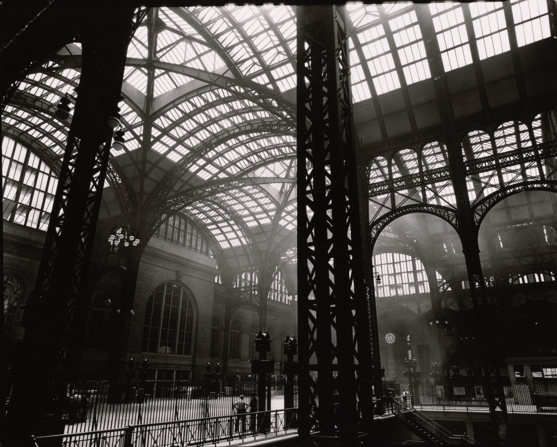
Berenice Abbott, 1936
Penn Station
5×4
Silver gelatin print
Reading about Abbott’s work there was something said about how although her subjects were of stone etc, they had the emotion of a portrait, and talking about how she could even shoot girders in a pictorial style. This is what I like about her stuff. It is set in New York, a city which just oozes character, and her photographs reflect this. I love the light coming in through the many small panes of glass, the smoke lit up in the concourse behind the sharp dark structures at the front of the image.
Richard Nickel
Around 1960
Natural light
Taught photography by Aaron Siskind who gave him and his fellow classmates and assignment (one day in the 50’s) to go out in Chicago and photograph buildings by architect Louis Sullivan. Nickel had had no interest in architecture before then but found himself captivated by Sullivan’s work. He then spent the rest of his life photographing these buildings and campaigning against their closures. He eventually died trying to salvage architecture from one of these demolished buildings after it collapsed on him in 1973.
I would think this would be in the category ‘creative interpretation’ of architecture
The several layers of different styles attracted me to this image. Bright lights and fanciness at street level, then up to the romanesque arches with the intricate carvings then up again to a level which looks split in half. I find it exciting to look at
The image works well with the people in it. I don’t think it would’ve been quite as perfect to me without the people giving scale and life to the photo
It really suits being black and white. Everything stands out without any clashing colours which may have made it too much
One of my favourite adverts, it was made for John Lewis in Autumn 2012. It is a split screen set up with the left side being a woman on a date in the 1920s and they man on the right on a date in the present day. They never physically meet, though they are in the same street, cinema, nightclub etc, the idea being ‘while many aspects of our lives today are different to how they were almost 100 years ago, the really important things haven’t changed at all’ I like the romance, nostalgia and wistfulness of it. I also like the colour grading, the situations and the props etc they use to convey two time periods almost 100 years apart. The camera is mainly centred due to the split screen although does sometimes come in from the sides when the characters are on their own ie it pans in to their jobs from the sides. Everything is mirrored so it pans symmetrically. There is a mixture of wide shots, mid shots, close-ups etc. The soundtrack is Never Tear Us Apart by Paloma Faith (originally by INXS) which is dubbed over the entire advert. It’s typically John Lewis, big budget (£7 million) captures your attention and leaves you with a nice feeling. Good marketing from them as usual.
This is a wedding video by a friend’s brother. He has won quite a few awards and I really like his stuff. He was self taught, following videos on Youtube etc. This is a gorgeous video, the colours are beautiful, it is dreamy, possibly a bit instagram filter-y but I think that’s a wedding thing. The soundtrack really sets this off for me, starting with the radio on with the date in the morning, followed by the speeches and finishing with a gentle song, it is engaging but doesn’t dominate the video. There is a lot of attention to detail here, and a mixture of techniques and shot lengths.
This is a fun one to watch, a race through Edinburgh, Bikers vs Parkour, from Norrie the Piper at Castlehill they make their way through the city, ending up at Arthurs Seat. The colour is good, it is bright, clean, just making Edinburgh look less grey and more inviting, with better weather! The camera is moving all the time following the guys. It’s mostly wide shots and extra wide although there are mid shots throughout also. I think the music was original and piped with a synthesizer used. A good advert for Edinburgh.
Task 3
Markets for Photographers using DSLR Video
Weddings are a huge market and if clients can book one company to do the photos and video instead of two they will, and if you are able to provide both you have a better chance of being hired.
Video is a great medium for advertising, not only the adverts you see on tv but also for use on websites, Youtube etc. A good way to promote your business, being that Youtube is one of the largest platforms in the world. Video content is a great way to catch attention, specifically with the Millennial markets who will click on a video and you have time to capture their attention and get across what you want to say.
In the music and entertainment business, documentary style videography is popular, giving an insight into the behind the scenes action of your favourite singer or band.
Estate agencies increasingly use videos, alongside photos to market properties for sale. There are many properties go on the market each day so it’s a good opportunity for a photographer who can do both.
These are a few of the markets where Photographers would benefit from being able to do video as well. If you can’t use the video functions on your camera and shoot and produce a half decent moving image you may well be at a disadvantage in the very competitive Photography industry.


You must be logged in to post a comment.