
- Julius Shulman, 1958
- Bailey House
- Architect is Pierre Koenig
- Style is fine art
- Images shown in galleries and museums all over the world
- 5×4 crop
- Silver gelatine print
- His work, all modernist, much of it based in LA has a geometric look to it. Partly because of the architecture itself of course but using black and white film to shoot adds to the geometry due to removing distracting colours and making it all about the shapes. He uses leading lines and rule of thirds a lot
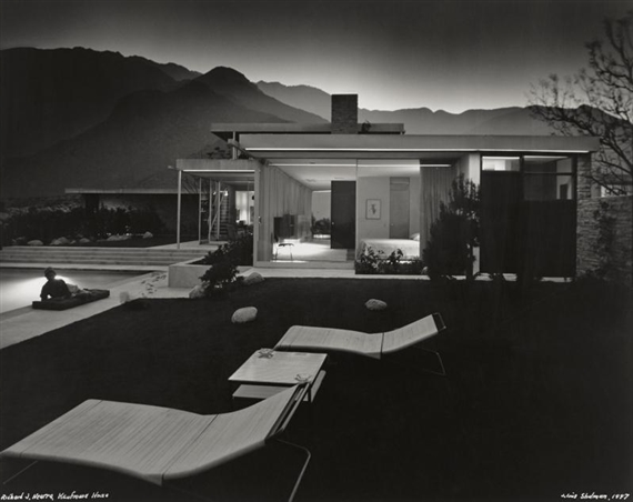
- Julius Shulman, 1947
- Kauffman House
- Architect Richard Neutra
- 5×4 crop
- Silver gelatine print
- Story behind this is the photographer, Schulman was photographing interiors at this house for the Architect. He seen outside was lit beautifully highlighting the hills etc. The architect told him he wasn’t allowed to go out and photograph it but he packed his kit up and went outside and did it anyway. He put it on a long exposure and ran in the house and put different lights on for different times etc. Right at the end he asked the architects wife to lie down on the lounger by the pool. Then he got dragged back in! To this day it is one of his most renowned photographs. Shulman has lots of good stories about his photographs which I think makes his work even better to look at – when there is a story about it
- I wanted to compare two of his images, I think these two are quite different. For me the Bailey house is my favourite. I love the bright tones, high contrast and clean lines although I think this image was done really well too and it’s amazing that it was unplanned and came out a piece of famous art. In the first image we are right in the house focusing on the angles, the second I feel was less focused on the building and more used it just as a part of an image

- Eugene Wei
- Ribbon Chapel
- This is an interesting subject and I’ve seen many good photos of it, I chose this one because of the lighting and sky
- I assume it was taken at dusk and the setting sun casts a beautiful light on the inside of the ribbon
- The subject is in the centre and takes up most of the frame and the path leads your eye straight to the architecture

- Gewinner Residence
- Architecture Magazine
- Cool, Geometric building
- Use of Rule of thirds and Negative Space
- I like how the sky is light at one side and dramatic at the other where the large sharp edges are
- I like the contrast of the warm lights inside against the cool tones outside.

- Mike Kelley
- Strobing
- I watched the process of this image being made. Mike Kelley uses two speedlights to light the entire subject in stages and then layers the images in Photoshop. I thought it was quite an interesting thing to do. I have done this before but not with architecture!
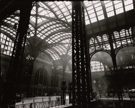
- Berenice Abbott, 1936
- Penn Station
- 5×4
- Silver gelatin print
- Reading about Abbott’s work there was something said about how although her subjects were of stone etc, they had the emotion of a portrait, and talking about how she could even shoot girders in a pictorial style. This is what I like about her stuff. It is set in New York, a city which just oozes character, and her photographs reflect this. I love the light coming in through the many small panes of glass, the smoke lit up in the concourse behind the sharp dark structures at the front of the image.

- Richard Nickel
- Around 1960
- Natural light
- Taught photography by Aaron Siskind who gave him and his fellow classmates and assignment (one day in the 50’s) to go out in Chicago and photograph buildings by architect Louis Sullivan. Nickel had had no interest in architecture before then but found himself captivated by Sullivan’s work. He then spent the rest of his life photographing these buildings and campaigning against their closures. He eventually died trying to salvage architecture from one of these demolished buildings after it collapsed on him in 1973.
- I would think this would be in the category ‘creative interpretation’ of architecture
- The several layers of different styles attracted me to this image. Bright lights and fanciness at street level, then up to the romanesque arches with the intricate carvings then up again to a level which looks split in half. I find it exciting to look at
- The image works well with the people in it. I don’t think it would’ve been quite as perfect to me without the people giving scale and life to the photo
- It really suits being black and white. Everything stands out without any clashing colours which may have made it too much
